2Geaux Express Cantina Rebrand
Restaurant Brand Identity, Guidelines & Multi-Channel Rollout
When Harrah’s New Orleans expanded 2Geaux Express beyond its original quick-service concept into a full cantina experience featuring tacos, margaritas, and beer, the restaurant required more than a new logo. The project grew into a complete visual identity and documented application system spanning campaign strategy, menu architecture, environmental graphics, digital signage, and production-ready assets.
Deliverables included brand identity, production templates, digital signage, promotional campaigns, and a reusable asset library designed for long-term scalability.
Role: Lead Designer
Client: Harrah's New Orleans
Deliverables: Brand Identity, Brand Guidelines, Campaign Development, Menu Systems, Environmental & Digital Signage
The Challenge
2Geaux Express relied on temporary promotional graphics that lacked a cohesive visual identity. The goal was to establish a recognizable restaurant brand that could grow beyond a single campaign while remaining compatible with Harrah's New Orleans' larger visual ecosystem.
The solution needed to work equally well across digital menu boards, environmental graphics, promotional advertising, and future signage without requiring separate redesigns for each application.
Design Objectives
✓ Build a flexible identity system
✓ Support co-branding with Harrah's
✓ Create reusable production assets
✓ Scale across print and digital
✓ Prepare for future environmental graphics
✓ Simplify future marketing production

LOGO REDESIGN
Building a Flexible Brand Identity System
Rather than designing a standalone logo, the objective was to create a flexible visual system capable of adapting to a wide range of marketing and operational needs.
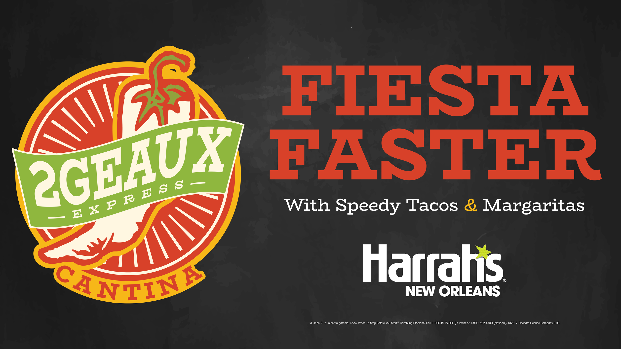
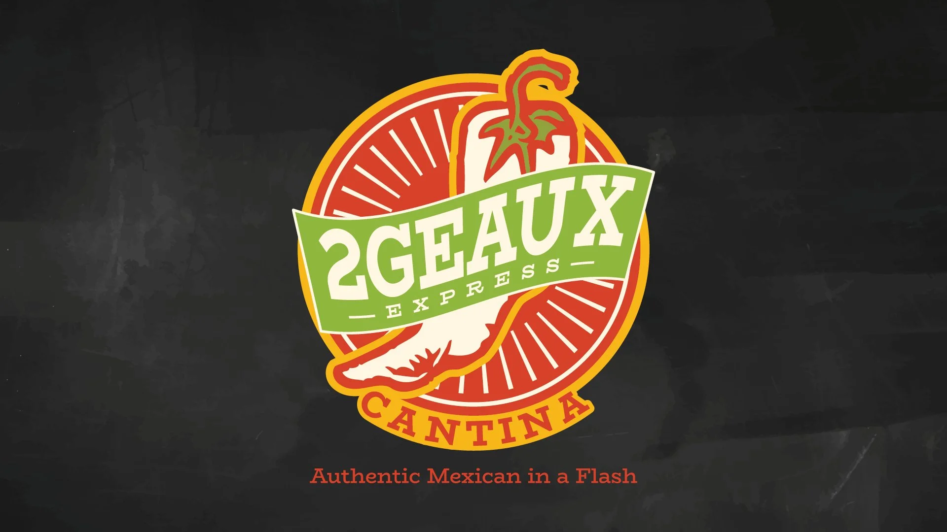
Multiple logo configurations, lockups, and color variations were developed to ensure the identity remained recognizable whether used on digital displays, printed collateral, promotional graphics, or future dimensional signage.
Because the restaurant operated inside Harrah's New Orleans, the system also needed to integrate comfortably alongside an established corporate brand without losing its own personality.
Establishing the Visual Language
Following logo development, multiple visual directions were explored to establish the broader personality of the brand.
Early concepts combined bold color blocking, food photography, custom illustrations, and textured environments inspired by contemporary cantina culture. These explorations helped define the visual vocabulary before moving into final production applications.
Building the System
Designing for Scalability
As the visual system expanded, the focus shifted from refining individual graphics to creating a brand framework that could support future marketing efforts with minimal rework. Each new application reinforced a common visual language through standardized typography, reusable layouts, and consistent branding conventions.
Early concepts incorporated hand-drawn chalk illustrations to reinforce the restaurant's personality. While visually engaging, they introduced practical challenges as layouts evolved. Decorative elements competed with supporting text, reduced flexibility when menu content changed, and required ongoing design judgment that would be difficult to maintain across future production work.
The final system intentionally simplified the visual language, allowing templates to accommodate changing content without sacrificing readability or brand consistency. Rather than treating every new piece as a unique design exercise, the project established repeatable components that enabled future menus, promotions, operational signage, and digital displays to be updated quickly while preserving a cohesive guest experience.

BRAND GUIDELINES & APPLICATION SYSTEM
Codifying the identity for consistent rollout
Once the visual direction was established, I translated it into a working brand-guidelines deck that defined logo hierarchy, approved color formulas, typography, background treatments, messaging, and format-specific applications. The document was designed as a practical reference for extending the identity consistently across print, environmental, and digital channels without rebuilding or reinterpreting the system for every new deliverable.
Together with the organized production asset package, the guidelines turned the approved creative into a reusable brand system rather than a collection of one-off layouts.
DOCUMENTED SYSTEM
Logo usage • Color palette • Typography
Background treatments • Messaging
Environmental signage • Digital menus
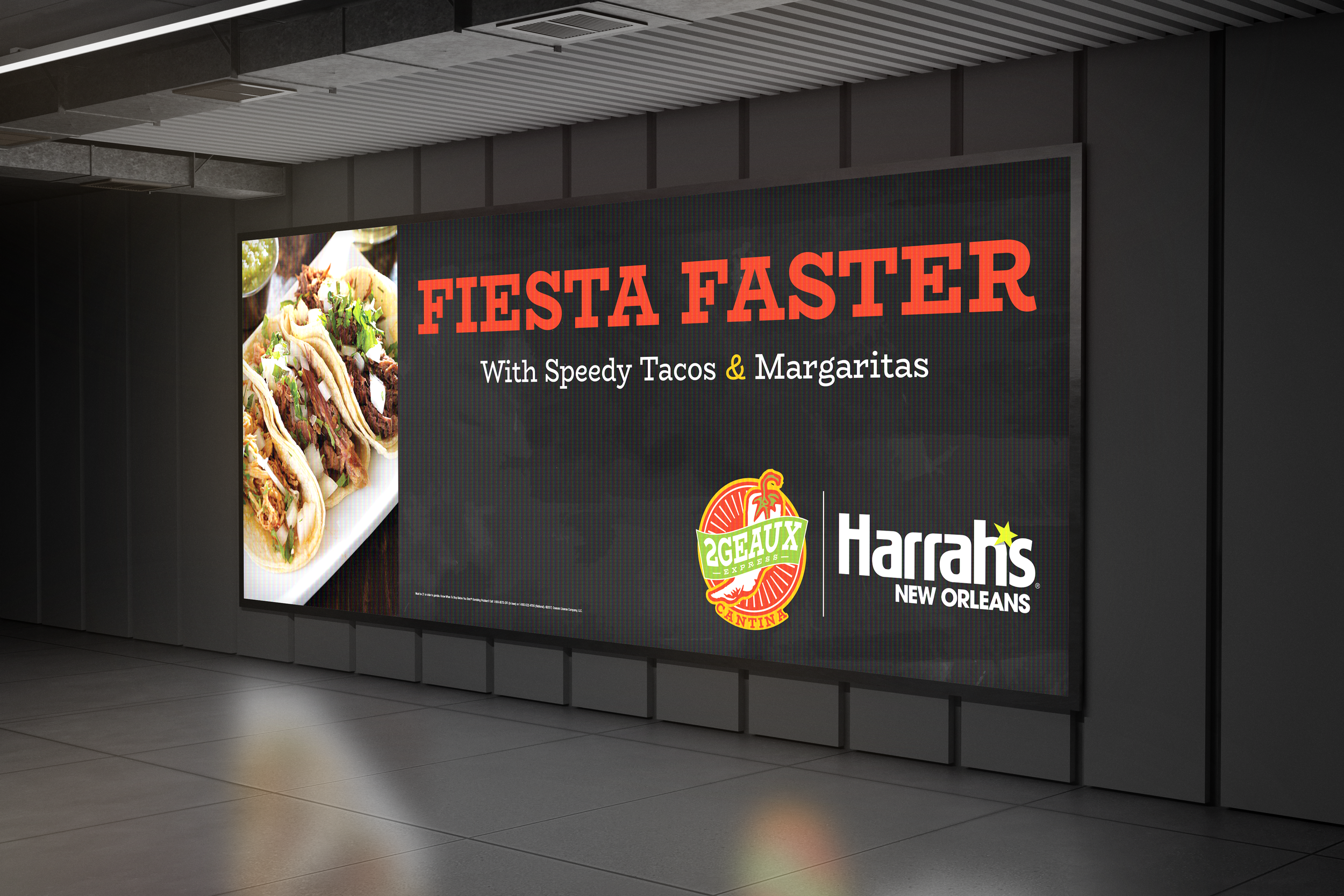
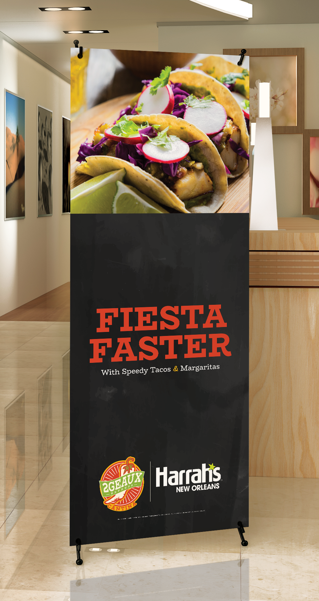
Promotional Campaign Applications
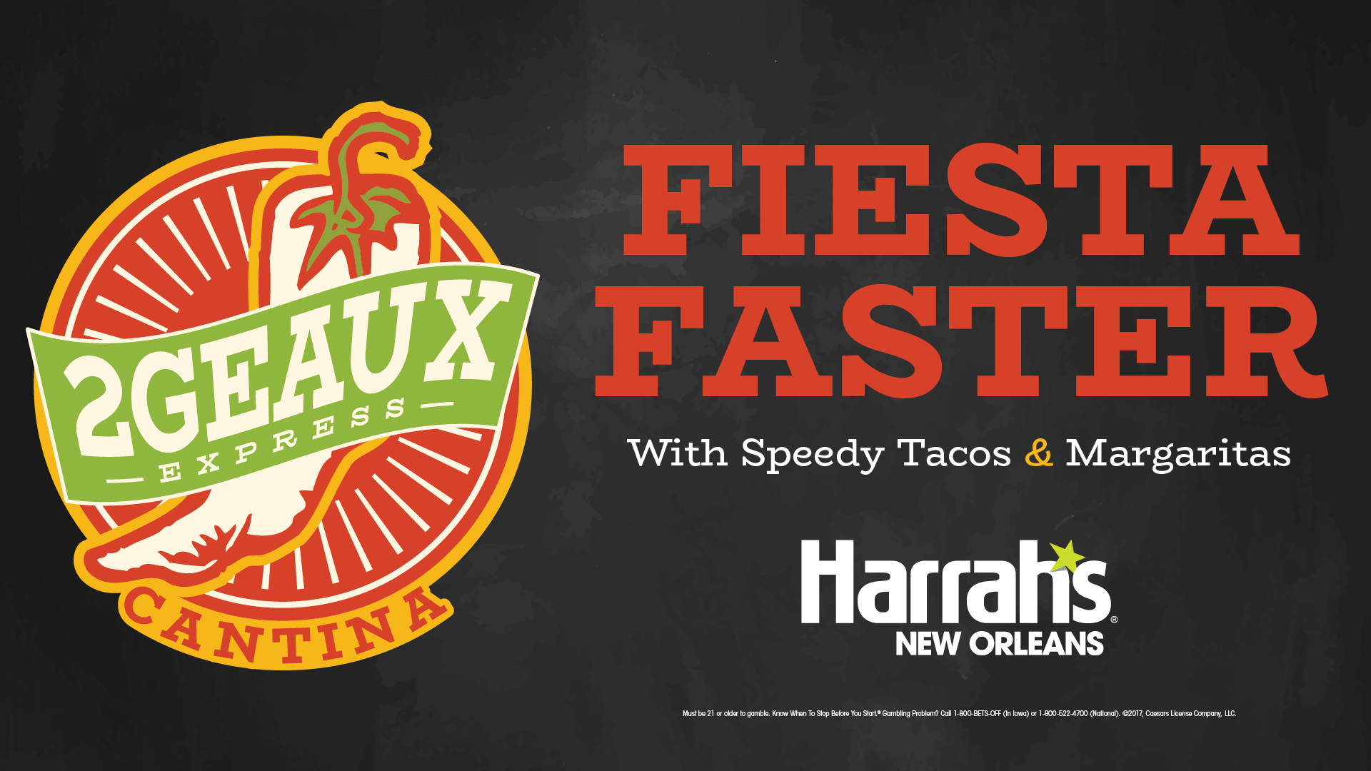
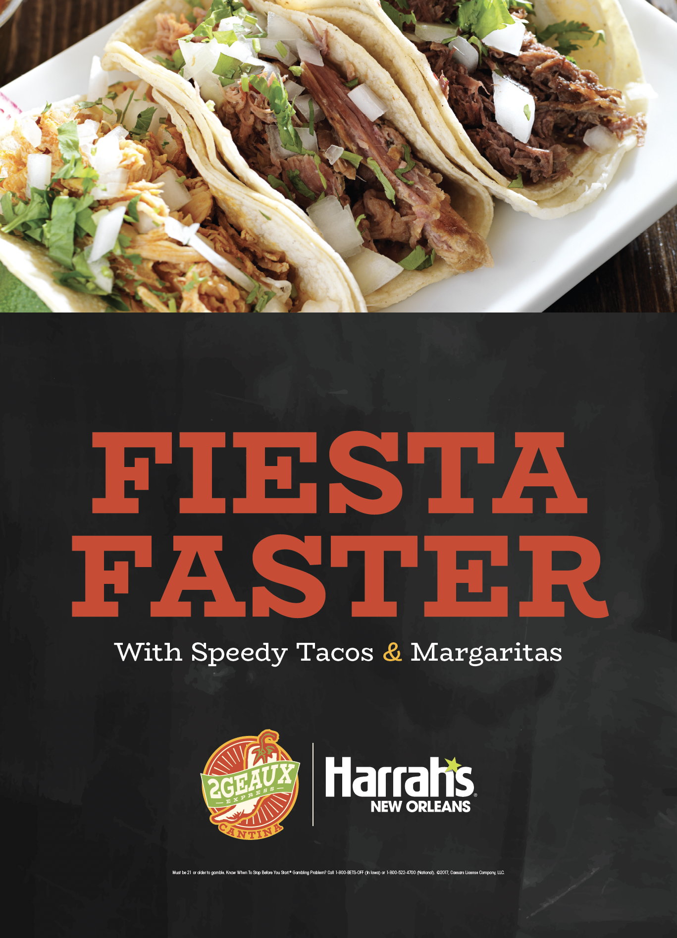
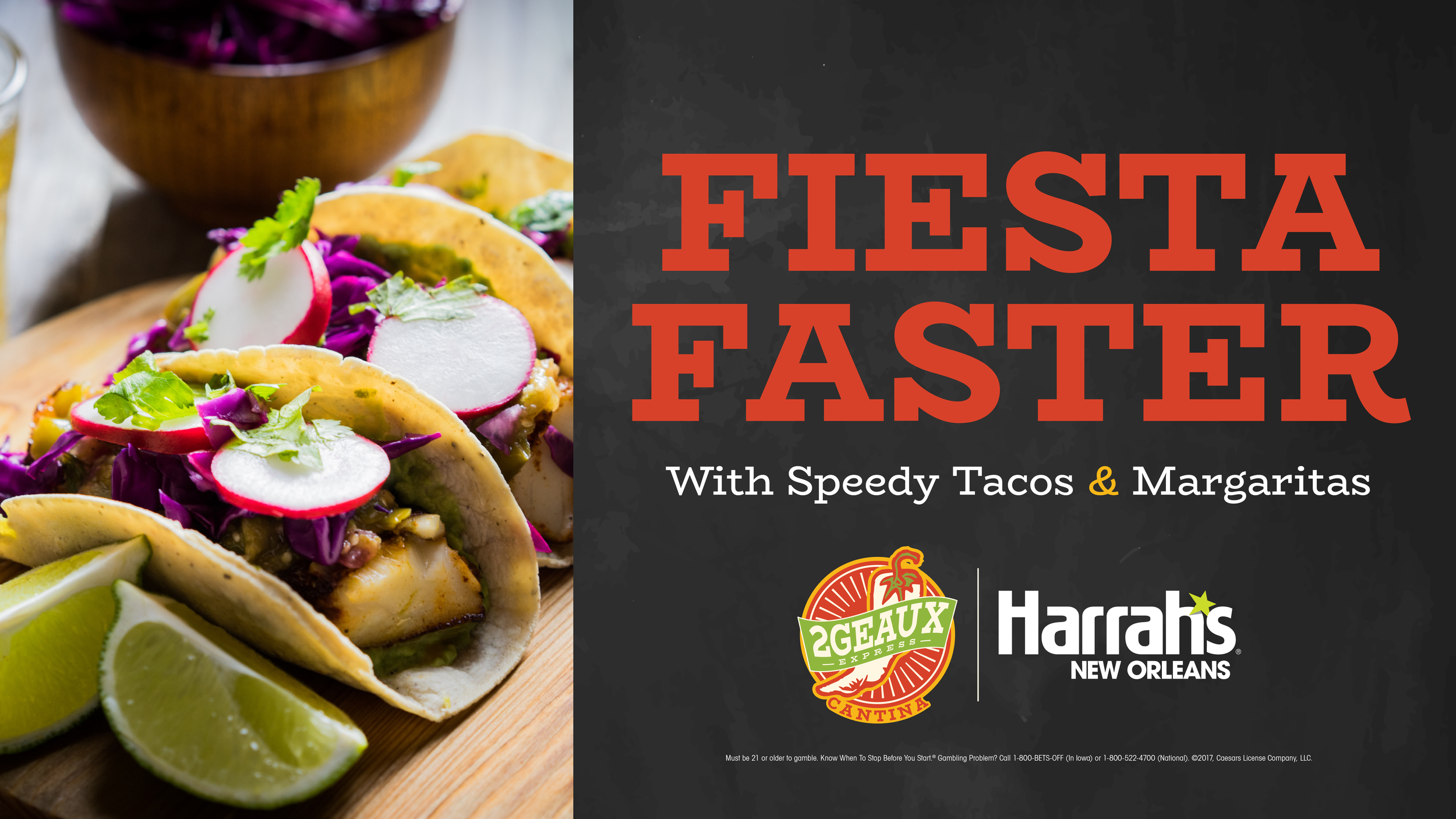
Once the identity system was established, it became the foundation for a wide range of marketing applications. Rather than creating individual pieces from scratch, each deliverable was built using standardized layouts, reusable assets, and consistent branding conventions established during the identity development process.
The resulting system supported promotional posters, digital advertising, environmental graphics, menu boards, operational signage, and seasonal campaigns while maintaining a cohesive visual language across every customer touchpoint. By designing flexible templates instead of isolated graphics, future designers and marketing teams could quickly produce new materials without rebuilding the brand for each campaign.
Digital Signage
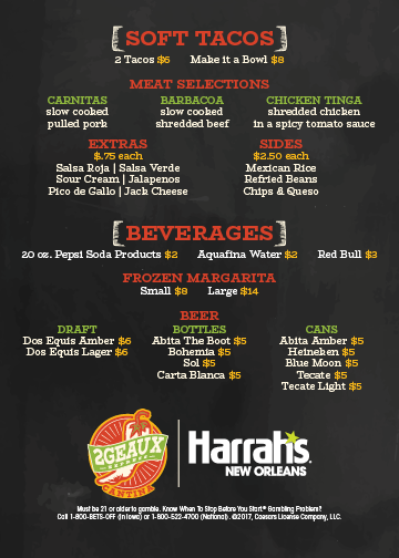
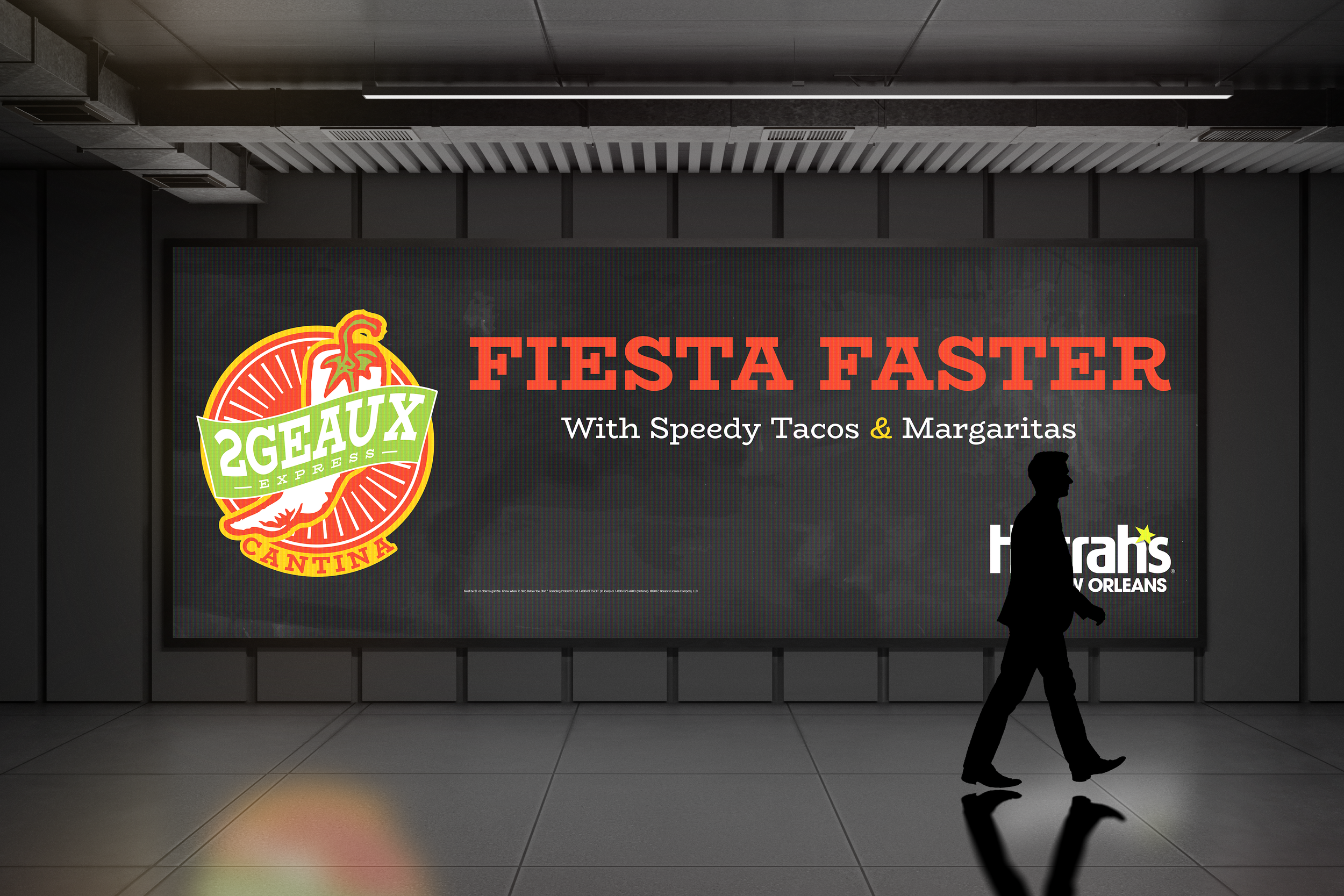
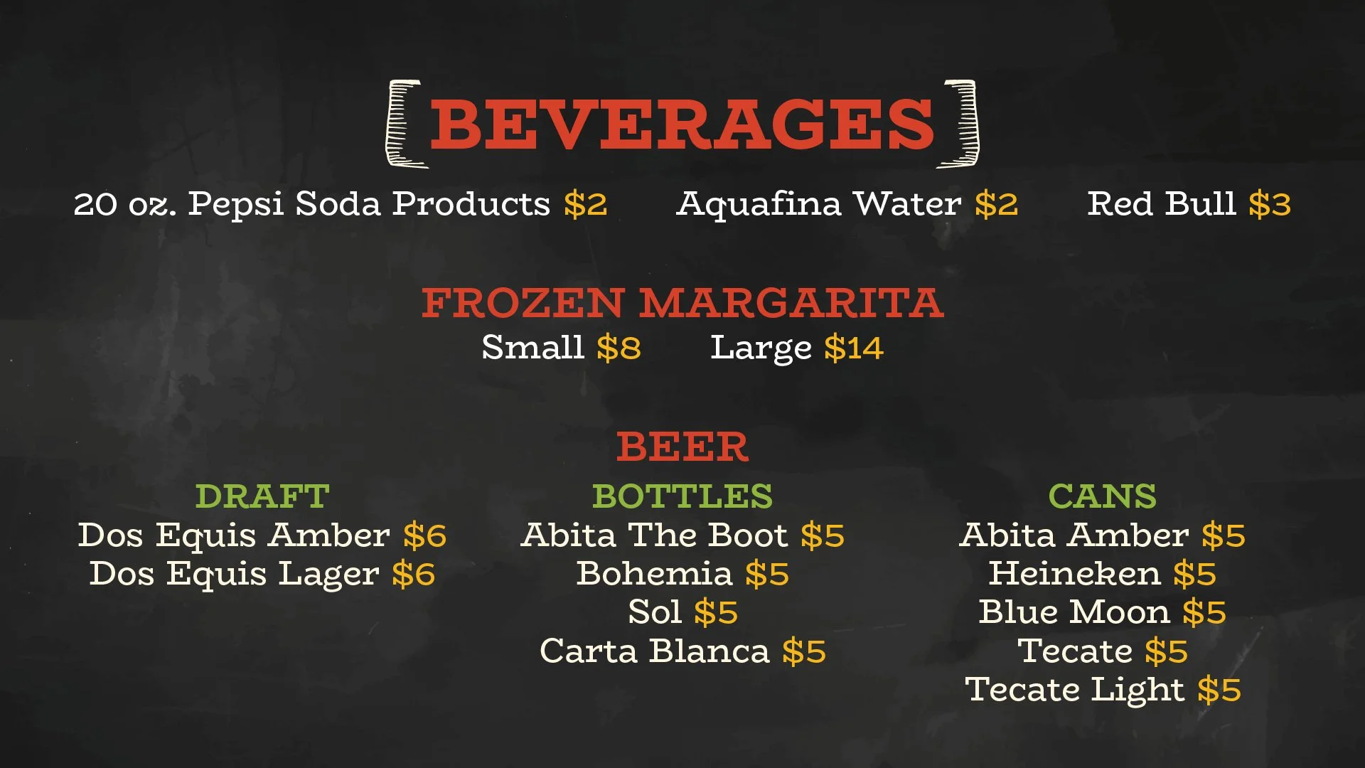
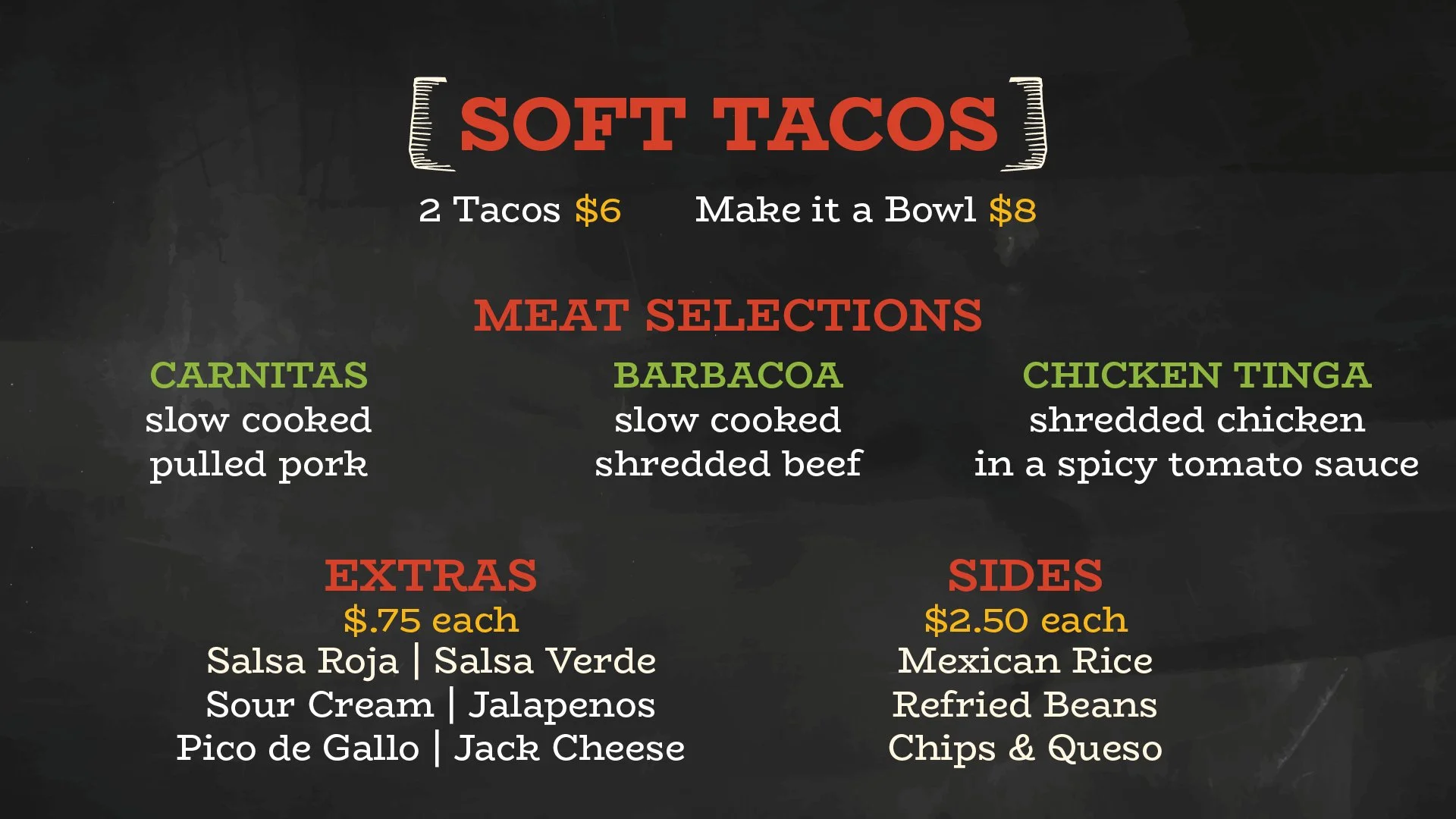
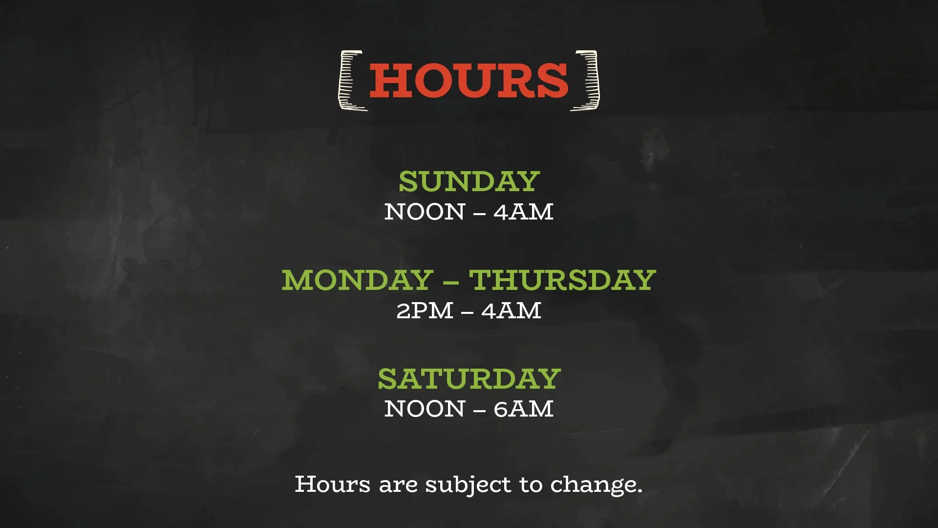
The digital signage system extended the brand into the restaurant's primary customer-facing environment. Modular layouts were developed to accommodate changing menu items, pricing, operating hours, and promotional messaging while maintaining consistent hierarchy and readability across every screen.
Because the system was built on reusable templates and standardized components, routine updates could be completed quickly without redesigning the overall experience. This approach ensured the restaurant could adapt to changing operational needs while preserving a consistent guest experience throughout the space.
Production Asset Package
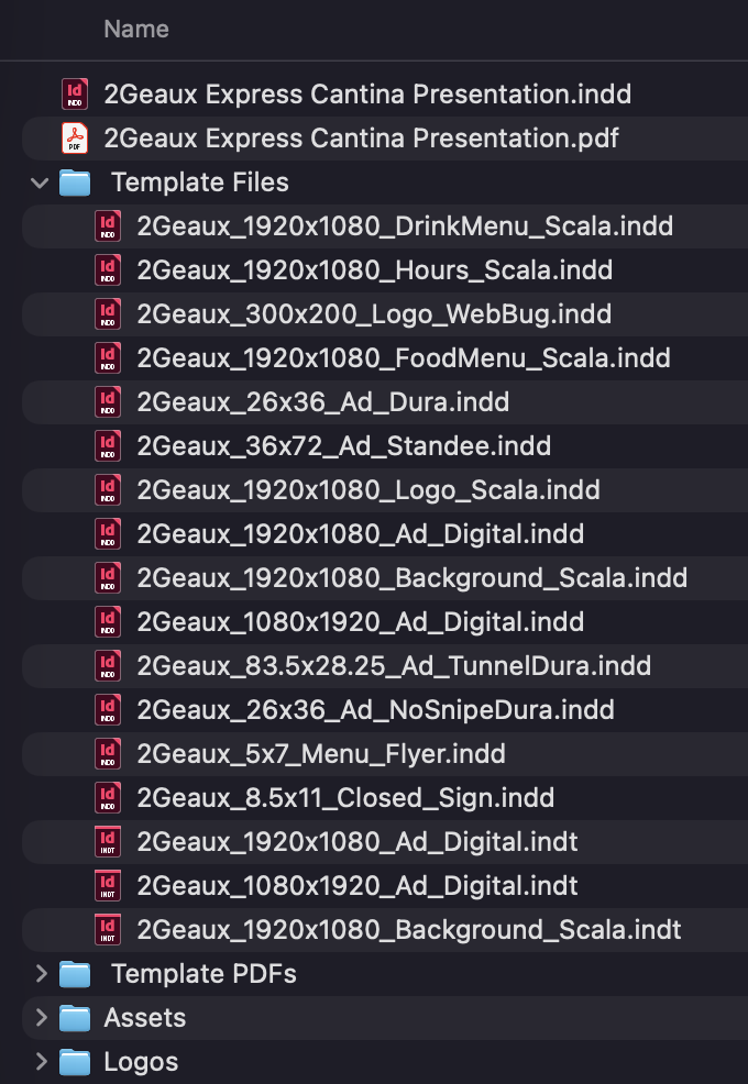
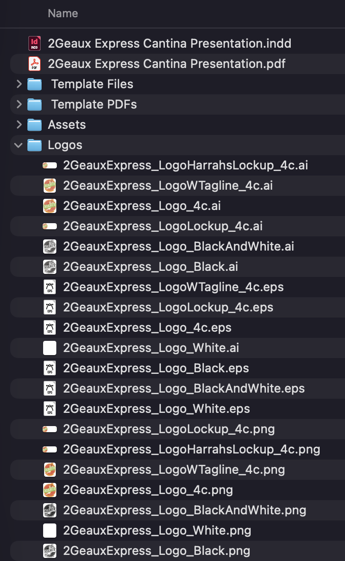
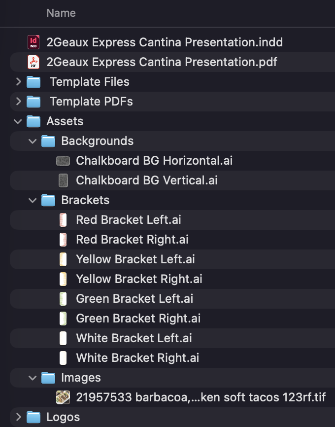
A successful brand launch extends beyond the final artwork. To support long-term use, the project concluded with a structured production package containing organized source files, reusable templates, linked assets, multiple logo configurations, and export-ready artwork for both print and digital applications.
The package was designed so future designers, marketing teams, and outside vendors could immediately create new materials without reconstructing existing work. Consistent file organization, standardized naming conventions, and production-ready assets helped ensure the identity remained scalable, maintainable, and easy to implement long after the initial launch.
REUSABLE TEMPLATES
PRODUCTION-READY DELIVERABLES
ORGANIZED ASSET LIBRARY
Additional Deliverables
The identity system was applied across a broad range of customer-facing and operational materials, demonstrating how a single visual language could scale across print, digital, promotional, and environmental applications.
Together, these deliverables illustrate the flexibility of the brand system and how reusable assets, standardized templates, and consistent design principles supported an evolving marketing program while maintaining a cohesive visual identity.