2Geaux Express Cantina Rebrand
Restaurant Branding, Identity System & Environmental Graphics
When Harrah's New Orleans expanded 2Geaux Express beyond its original quick-service concept into a full cantina experience featuring tacos, margaritas, and beer, the restaurant required more than a new logo. The project evolved into the creation of a complete visual identity system, campaign strategy, menu architecture, and environmental graphics program designed to support the new Cantina experience.
Role: Lead Designer
Client: Harrah's New Orleans
Deliverables: Branding, Campaign Development, Menu Systems, Environmental Graphics
The Challenge
Before the rebrand, 2Geaux Express relied heavily on Harrah's New Orleans branding. While the restaurant had its own logo, it lacked a dedicated visual system for menus, promotional advertising, signage, and guest communications.
As the concept expanded into a full cantina experience featuring tacos, margaritas, and beer service, the brand needed a more flexible identity capable of supporting both operational signage and marketing initiatives.
LOGO REDESIGN
Building a Flexible Identity System
The project began with the development of a scalable identity system capable of extending beyond a single logo application.
Deliverables included primary and secondary logo configurations, co-branded lockups, production-ready asset packages, and supporting artwork designed for use across digital, environmental, and promotional applications.
The resulting system ensured consistency across a wide range of formats while maintaining strong brand recognition within the Harrah's New Orleans environment.
Brand Direction Exploration
Following logo development, multiple visual directions were explored to establish the broader personality of the brand.
Early concepts combined bold color blocking, food photography, custom illustrations, and textured environments inspired by contemporary cantina culture. These explorations helped define the visual vocabulary before moving into final production applications.


Refining the System
Refining the Visual Language
While early concepts incorporated additional decorative elements and illustrative accents, stakeholder feedback and operational requirements revealed a need for greater emphasis on readability and information hierarchy.
The system evolved into a cleaner, more focused design language that preserved the warmth and personality of the selected direction while improving clarity across menus, directional signage, operating hours, and promotional materials.
The final solution balanced brand expression with practical day-to-day usability.
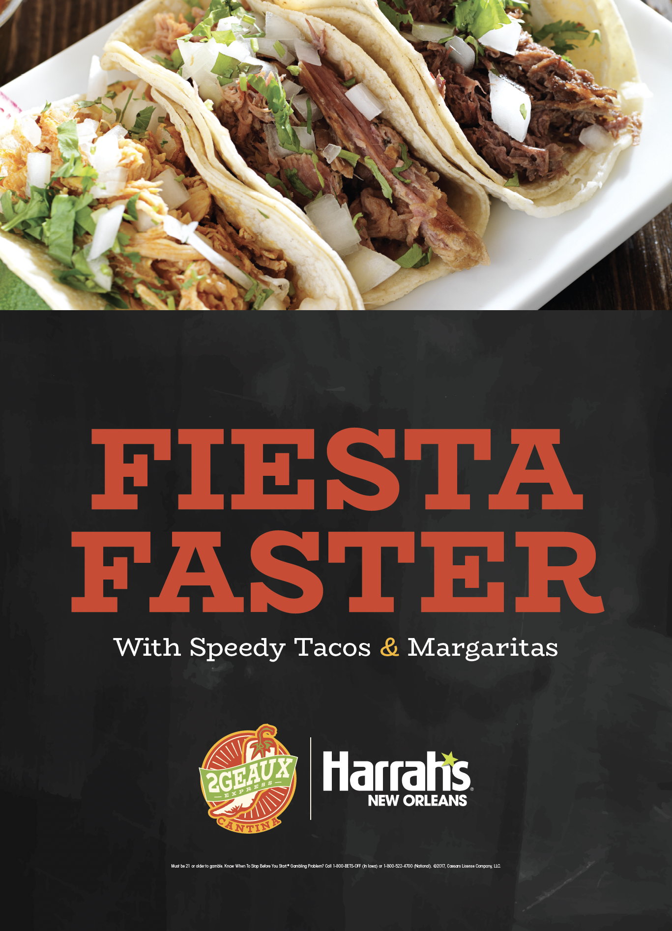
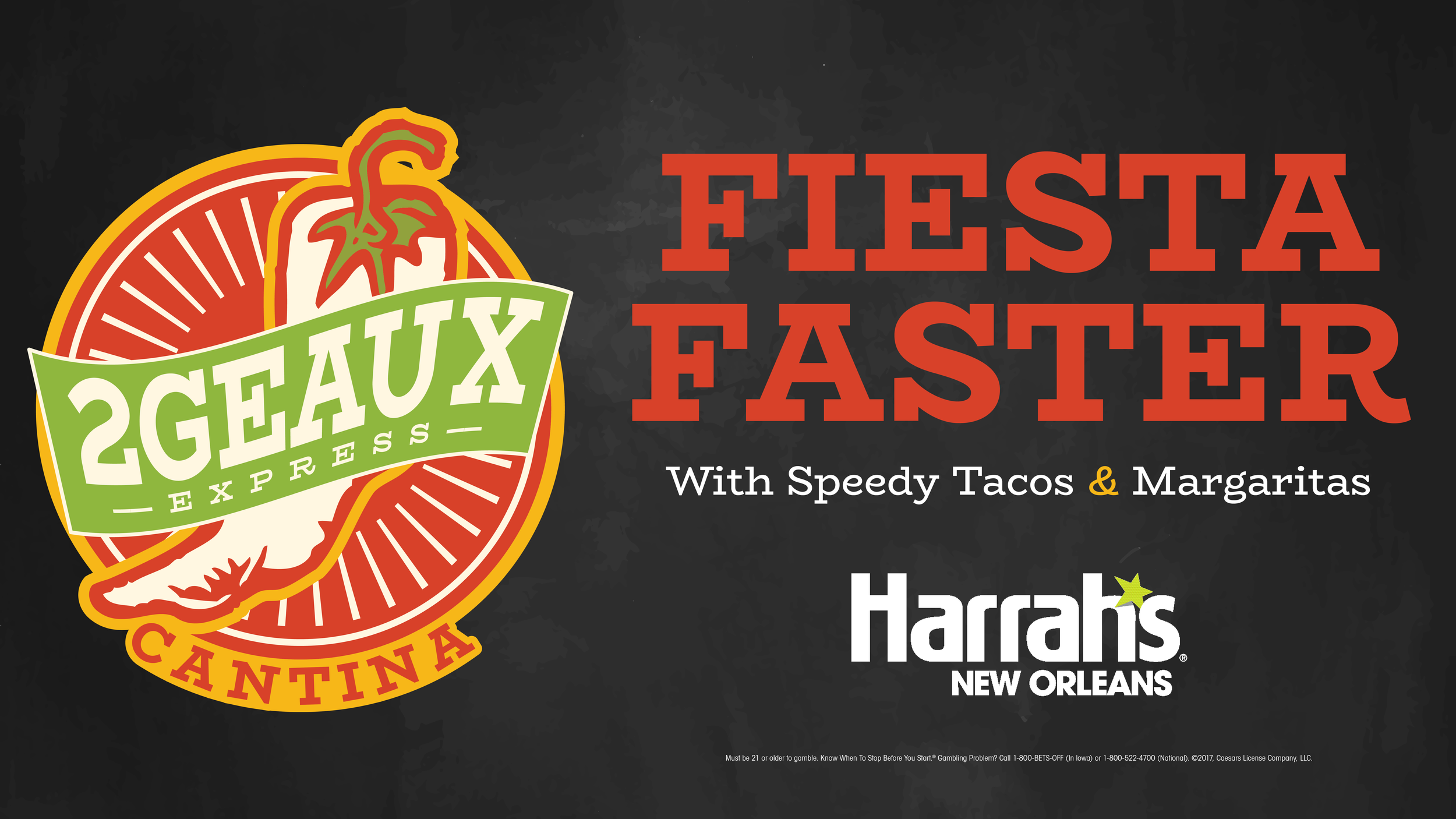
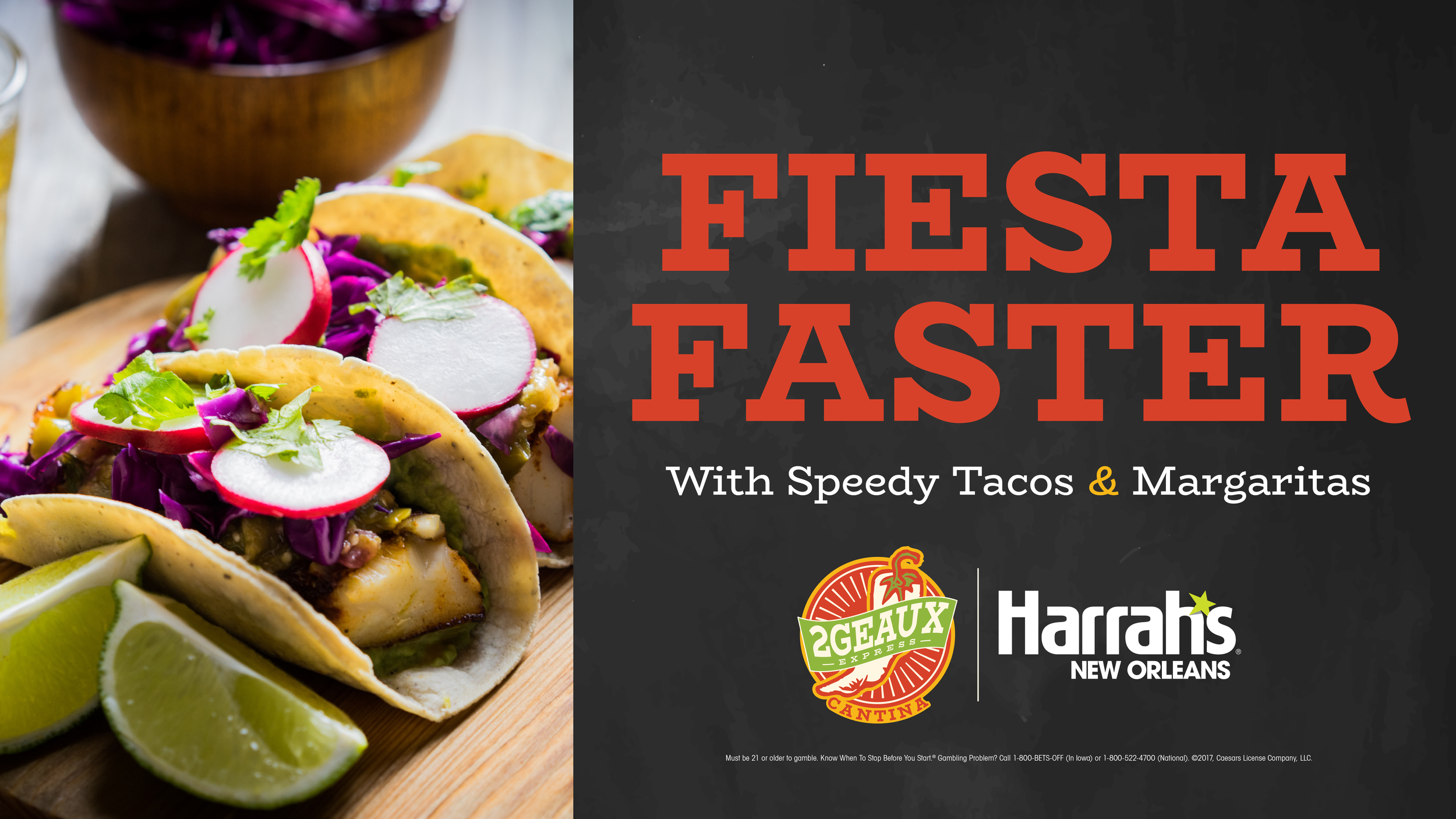
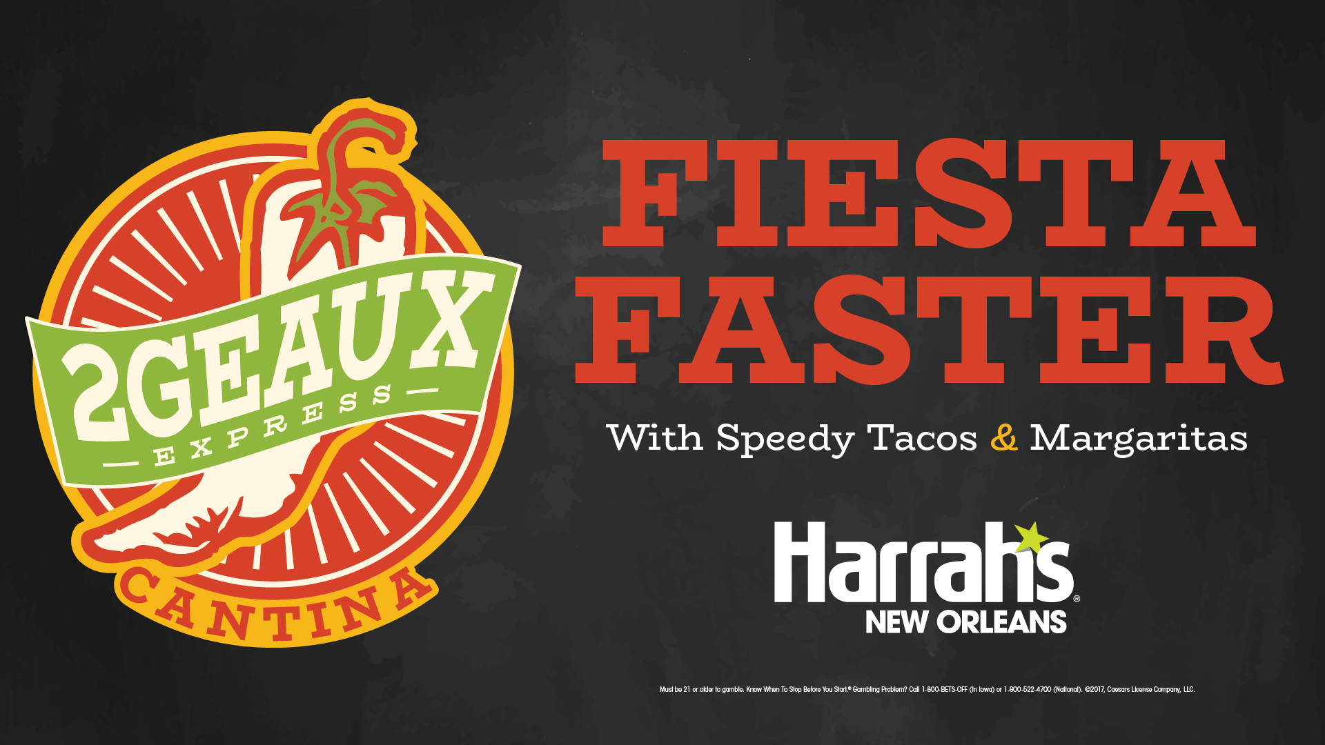
Promotional Campaign Applications
Following the identity rollout, the visual system was extended into a series of promotional advertisements supporting the restaurant launch.
Working alongside the copywriting team, I developed a cohesive set of print, environmental, and digital marketing assets that applied the brand consistently across multiple guest touchpoints while maintaining visibility within a highly competitive casino environment.


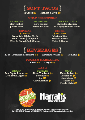
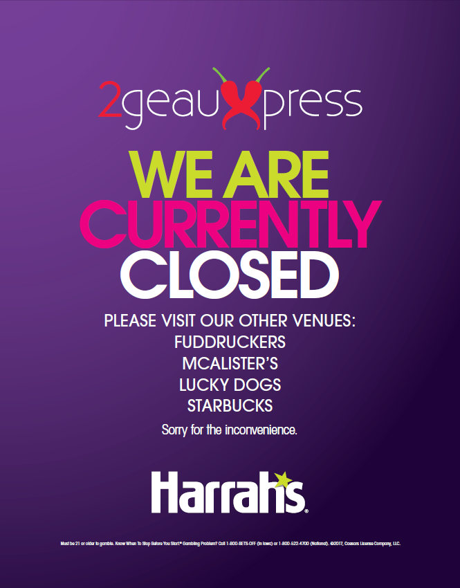
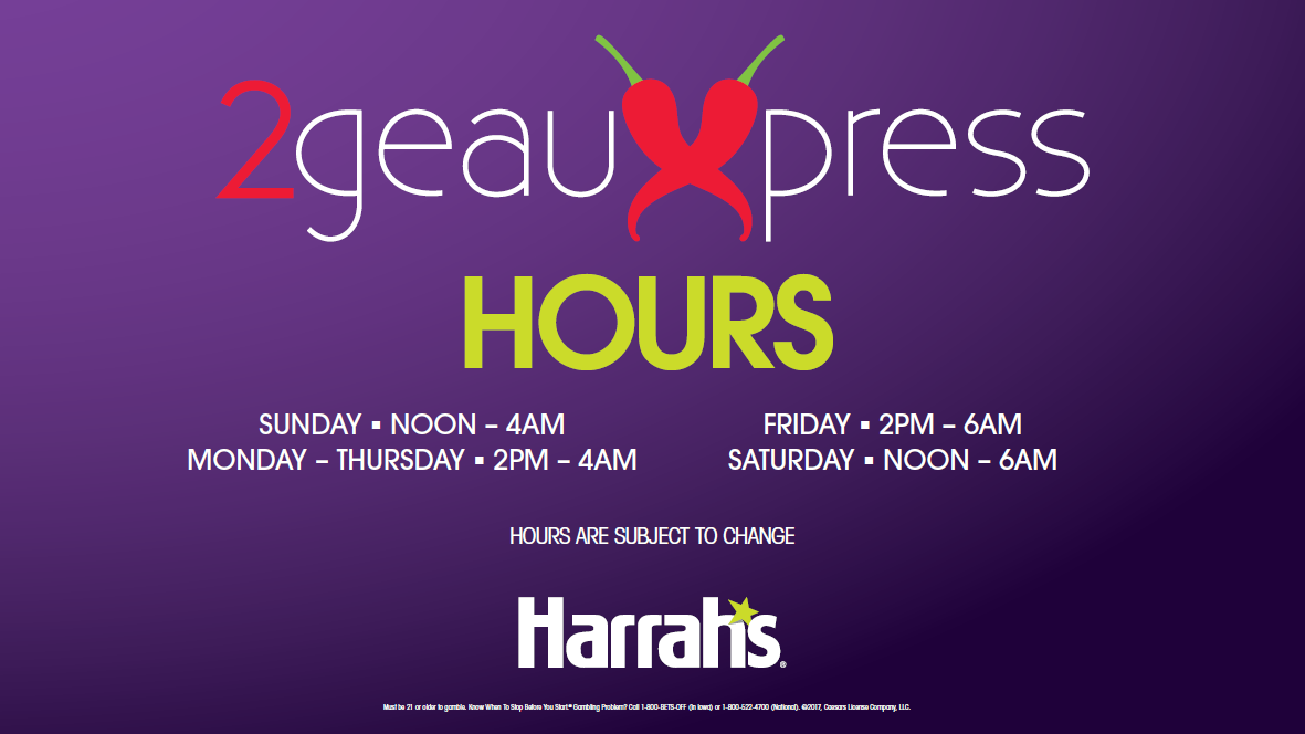
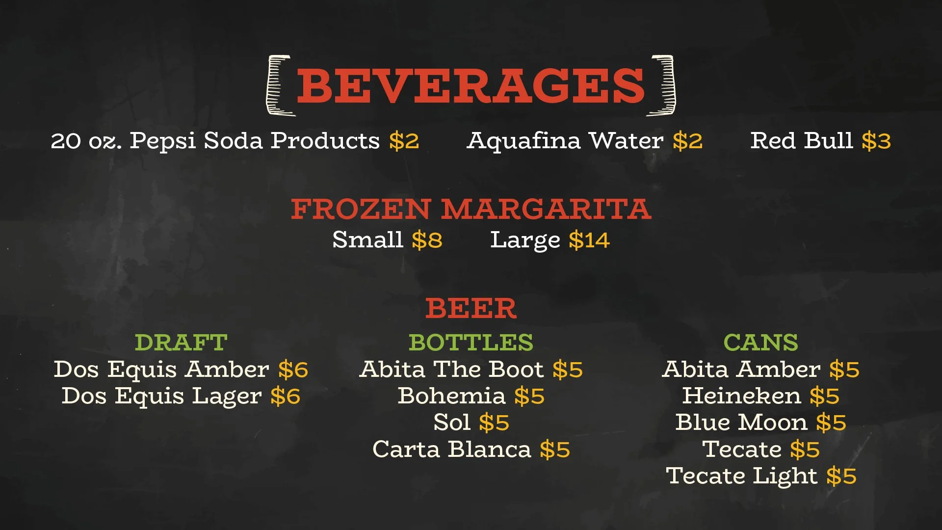
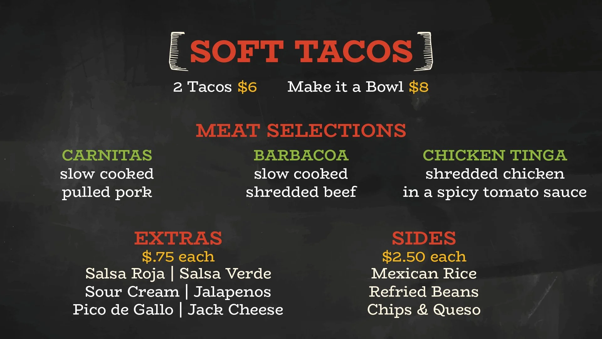
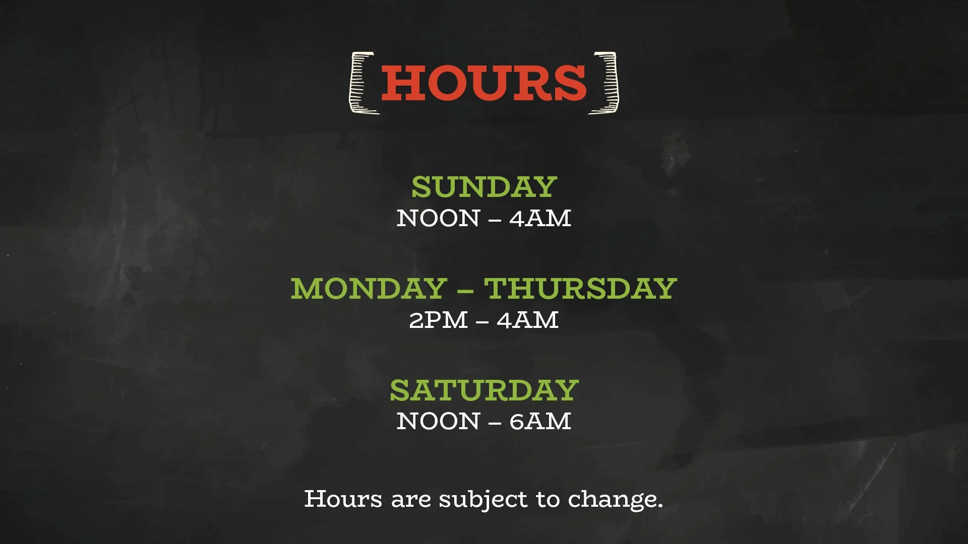
Digital Signage System
The restaurant utilized a network of digital displays for menu presentation, operating hours, promotional messaging, and brand awareness.
A modular visual framework was developed to ensure consistency across all screen content while allowing information to be updated quickly as menu items, pricing, and operating conditions changed.
Additional Deliverables
The identity system was extended across digital signage, menu boards, promotional graphics, operational communications, and environmental applications.