
Caesars Entertainment — New Year’s Eve 2020
A national, cross-property brand system for one of the largest New Year’s Eve celebrations in the world.
Role: Lead Designer / Art Director — concept through toolkit engineering,
production handoff, and late-stage consultation.
The Challenge
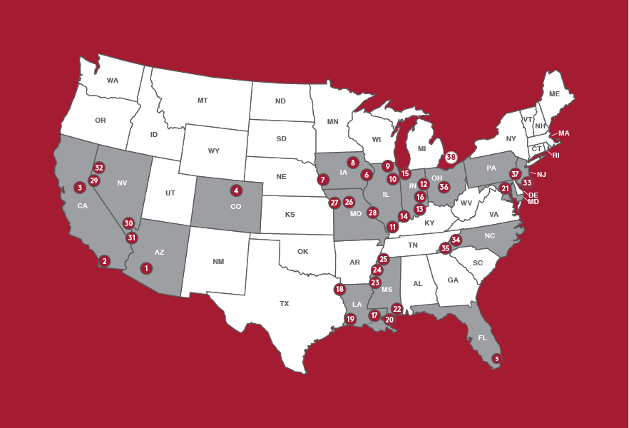
Every year, Caesars Entertainment’s New Year’s Eve programming fills hotel rooms, show venues, restaurants, and casinos across the country. With nine properties on the Las Vegas Strip, three in Atlantic City, and dozens more regional resorts, the company needed a unified brand system that could:
Scale from luxury foil invitations for high-end guests to direct mailers for local properties.
Carry across 40+ markets, each with its own identity and audience.
Extend into print, digital, environmental, and out-of-home media.
The system had to balance elegance with flexibility, ensuring that Caesars could stand apart in one of the most competitive event seasons of the year.

Exploration & Concept
My direction, “Celebrate in Style,” drew inspiration from Art Deco’s symmetry and glamour—an aesthetic link between “2020” and the 1920s. It was a timeless yet contemporary approach that aligned perfectly with Caesars’ positioning as both iconic and forward-looking.
Alongside visual explorations, I collaborated with copywriter Chris Helsabeck to create a brand voice that was elegant, celebratory, and adaptable to each property’s tone. Together, we ensured the system had both visual and narrative cohesion.
System Development
To make the system scalable and foolproof, I engineered a toolkit that included:
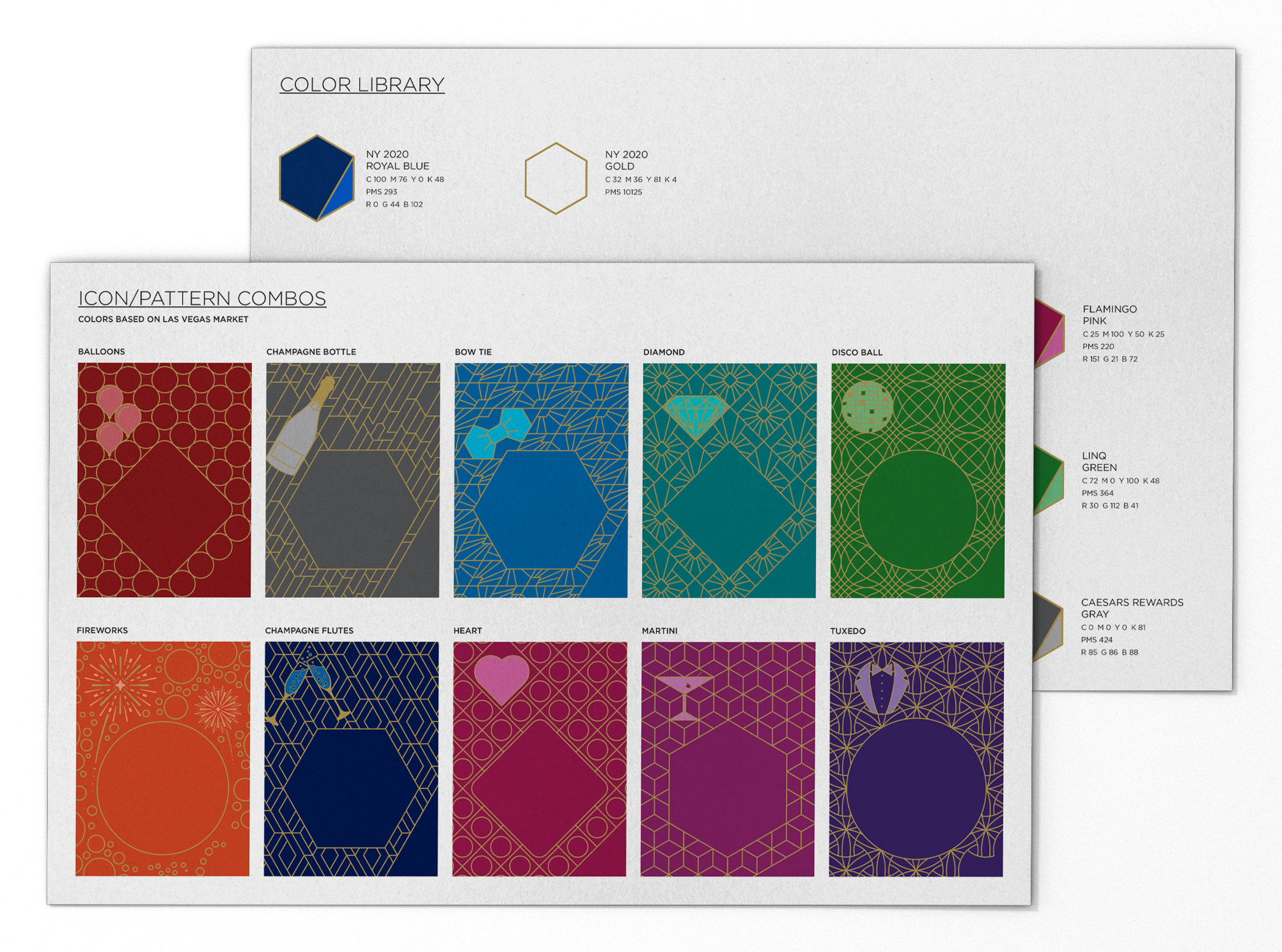
Universal color swatches preloaded for every Caesars brand.
Automatic overlay logic that generated color pops from a single design, streamlining production.
Property-specific icons and patterns, ensuring each venue could stand out without breaking cohesion.
A completely reimagined invite holder—an envelope-within-envelope solution designed to showcase multiple inserts (3–9 options per guest). I not only created its visual design, but also designed the mechanics of its folds, tabs, and glue strips to guarantee usability.
This was both a technical and creative undertaking—a system where production logic and design sophistication worked hand-in-hand.
Applications
The brand extended across every medium:
Print: Invitations, envelopes, inserts, menus, tickets, directional signage.
Digital: Email campaigns, landing pages, marquee graphics.
Environmental: Event signage, photo booth overlays, billboards.
Direct Mail: High-end multi-property packages for Las Vegas and Atlantic City; localized versions for regional properties.


Challenges & Solutions
Multi-market overlap: Built exclusivity rules for icons and patterns to prevent competing properties from using the same designs within local markets.
Budget demands: Designed a hybrid system using metallic inks for mid-tier pieces and foils for VIPs, achieving luxury without overspending.
Last-minute needs: Created a new icon/pattern design for non-brand specific uses and a secondary “midnight blue + white” sub-brand overnight to support additional signage requests and event differentiation.
Production efficiency: Templates were engineered so even less-experienced designers could produce flawless executions quickly and consistently.
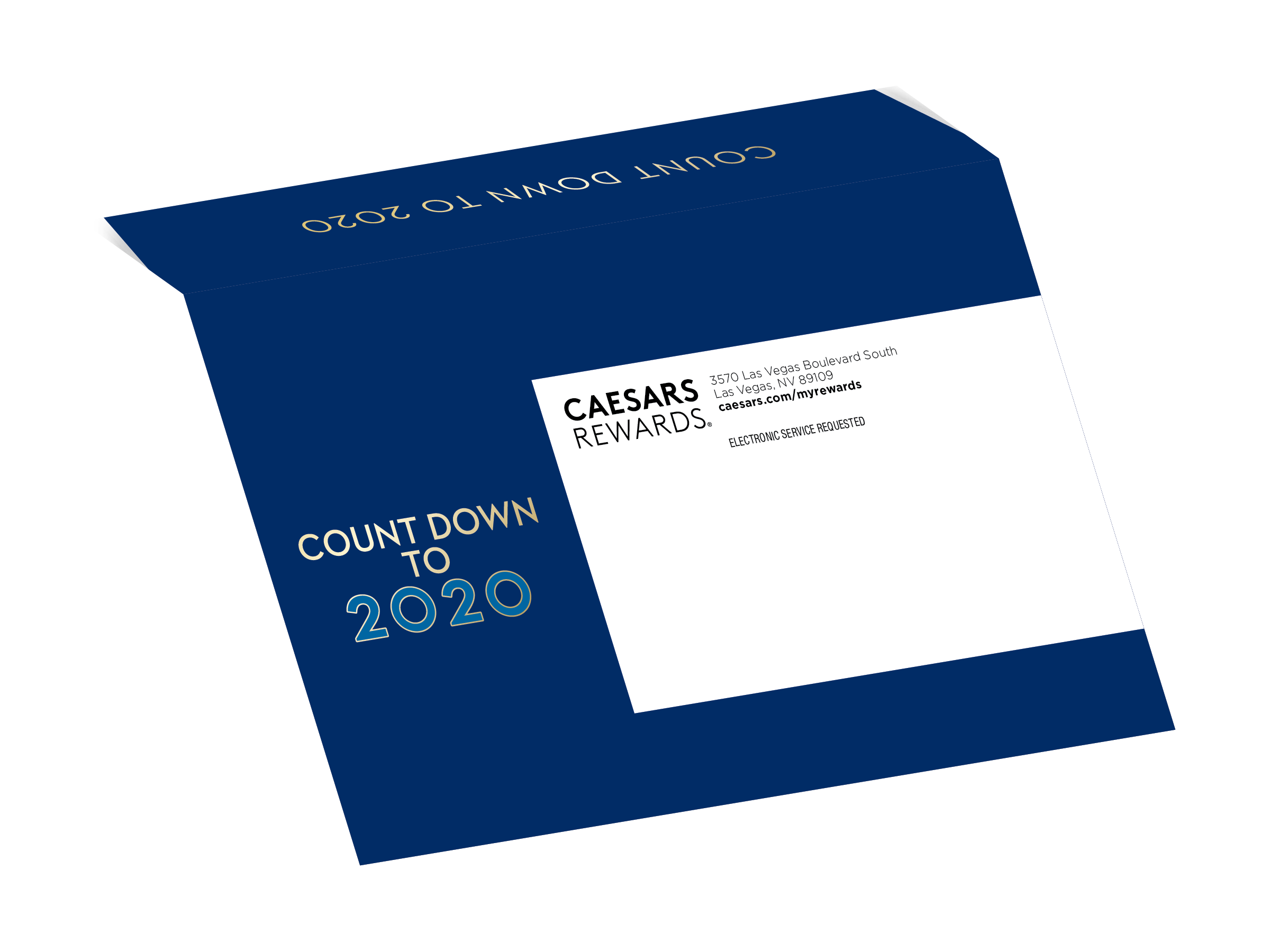
Envelope Front
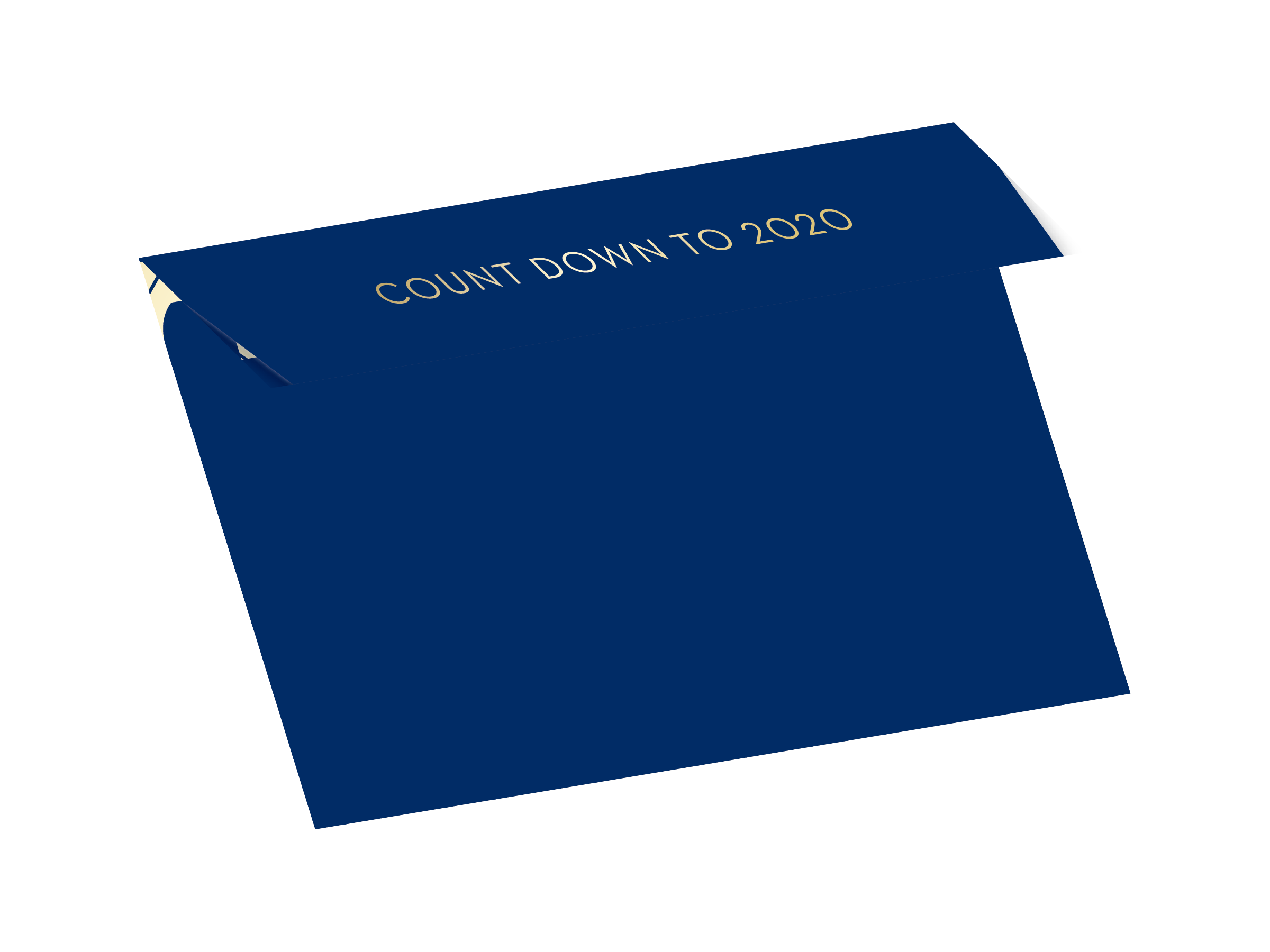
Envelope Back
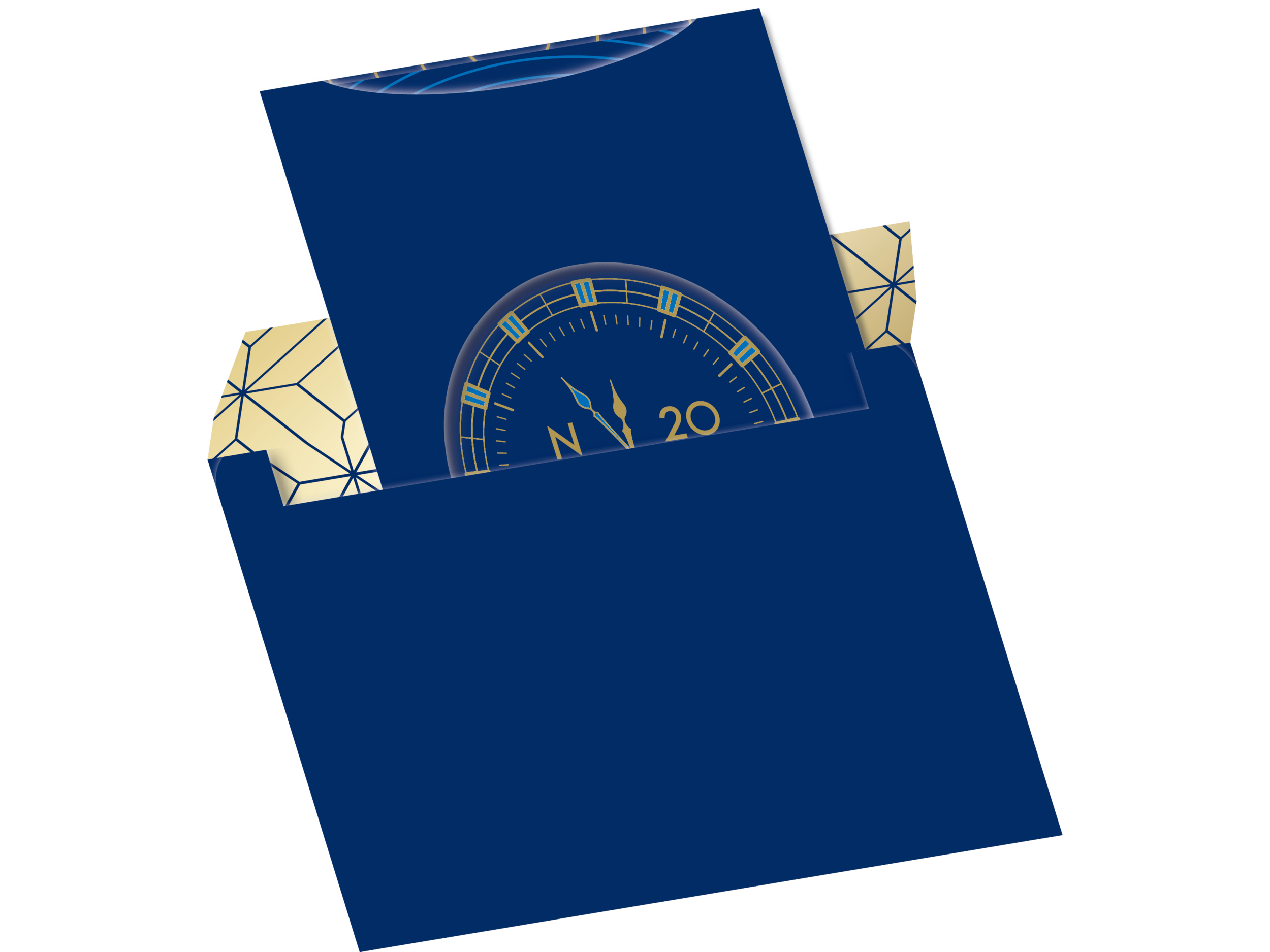
Envelope Inside with Invite holder and main invite
The invitation is designed to feel luxe from the first moment you see it's rich blue and pops of gold. The inside of the envelope is flooded with gold so the royal blue of the envelope can carry over to the sleeve that holds all the invites.
The holder is a first for an invite like this within Caesars, allowing for a peek at the main invite, showcasing the golden clock, nearing the stroke of midnight.

Inspired to connect the double 20s of the new year to the design aesthetics of the Art Deco movement, popular in the '20s, geometric patterns were created to bridge the classic and modern.
Twelve unique designs were developed, so that properties and brands were able to distinguish themselves to guests who would receive invites to more than one party, not just by brand color and logo, but by look, feel, and voice.
Each unique design had a corresponding icon that was made to fit within the pattern, with a subtle pop of brightness and glossy shine. Each pattern had a unique container shape for the invitation headline, which could be seen through the window in the invite holder if pages were removed one at a time. With the holder emptied, one final image is revealed, the clock striking Midnight, the party begins.

The headline container shape carried over to the rest of the invite, connecting the image frames to the design on the front. These designs extended to signage and collateral as well, where images were even further integrated into the overall design.